The 25 Best Data Visualizations of 2018
The art of making data beautiful is taking the world by storm. Data visualization experts and artists are creating amazing things in the world of data design every single day.
Data visualization is not a new phenomenon. Even before it was “cool,” data visualization was an important tool for visualizing data in many different fields.
Technically speaking, data visualization encompasses all things data art, infographics, and data dashboards. The range of creativity truly is endless, and we are excited to see how it will keep progressing.
What has happened over the last few years is that data and data analysis have taken on a new quality. Data and information is now a tool for creating beautiful visuals. What used to be simple charts and scatter plots are now complex and creative pieces of data art—some beautiful enough to hang up on your wall.
In honor of all the artists and designers making amazing data visualizations around the world, here is a collection of the best data visualizations of 2018. We included a few from 2017 and earlier, because they were just too good to pass up.
View each visualization by clicking on the source link to the right of the image.
Best Data Visualizations of 2018
History of Bruce Springsteen
image: https://visme.co/blog/wp-content/uploads/TopSongs-best-data-visualizations.gif

This data visualization by Adam McCann visualizes every single song ever recorded by Bruce Springsteen. Using data from Spotify and other written sources, he was able to plot every single aspect of every song. The albums and songs are organized by rank in popularity. Each design detail represents an aspect of the album. The theme is reminiscent of plants with seeds, leaves, and flowers. It includes a How to read popup for easier understanding.
Hello Sun app
image: https://visme.co/blog/wp-content/uploads/hello-Sun-best-data-visualizations.gif

The Hello Sun app created by Small Multiples, is a live data viz for your phone. The main dashboard visualizes the movement of the sun and moon in the sky in numerous cities in the world. The movement is depicted in circular sky maps that change color as the sun rises and sets. Each city is illustrated by a major landmark which is only seen when the sun creates a shadow of it. The app also lets the user know how sun behaves anywhere in the world through GPS coordinates. That way they can plan out a veggie garden or know if the apartment they want to rent will have sun in the afternoon.
Wind and Words
image: https://visme.co/blog/wp-content/uploads/WindWords-best-data-visualizations-visme.gif

Complicated movie series and long convoluted TV shows make for great data visualizations. One such example is the interactive data viz called Wind and Words designed by Impossible Bureau. Using the dialog in Game of Thrones , this complex data visualization depicts the interaction between characters through all the aired seasons of the show. There are sections for direct interaction, vocabulary used, sentiment for each character, and a last section on how the data was used. All in all a very interesting and fun to explore data viz.
Launch It
image: https://visme.co/blog/wp-content/uploads/LaunchIt-Shane-Mielke-best-data-visualizations.gif

When graphic designer Shane Mielke published his book, Launch It, he also designed an amazing online data visualization depicting where his book could be purchased. This interactive data viz is a spinnable world map showing live data of where the Launch It book can be acquired. To make it more interesting, the user can change the colors of the map and shapes of the markers.
Apollo
image: https://visme.co/blog/wp-content/uploads/Apollo-Paul-Button-best-data-visualizations.png
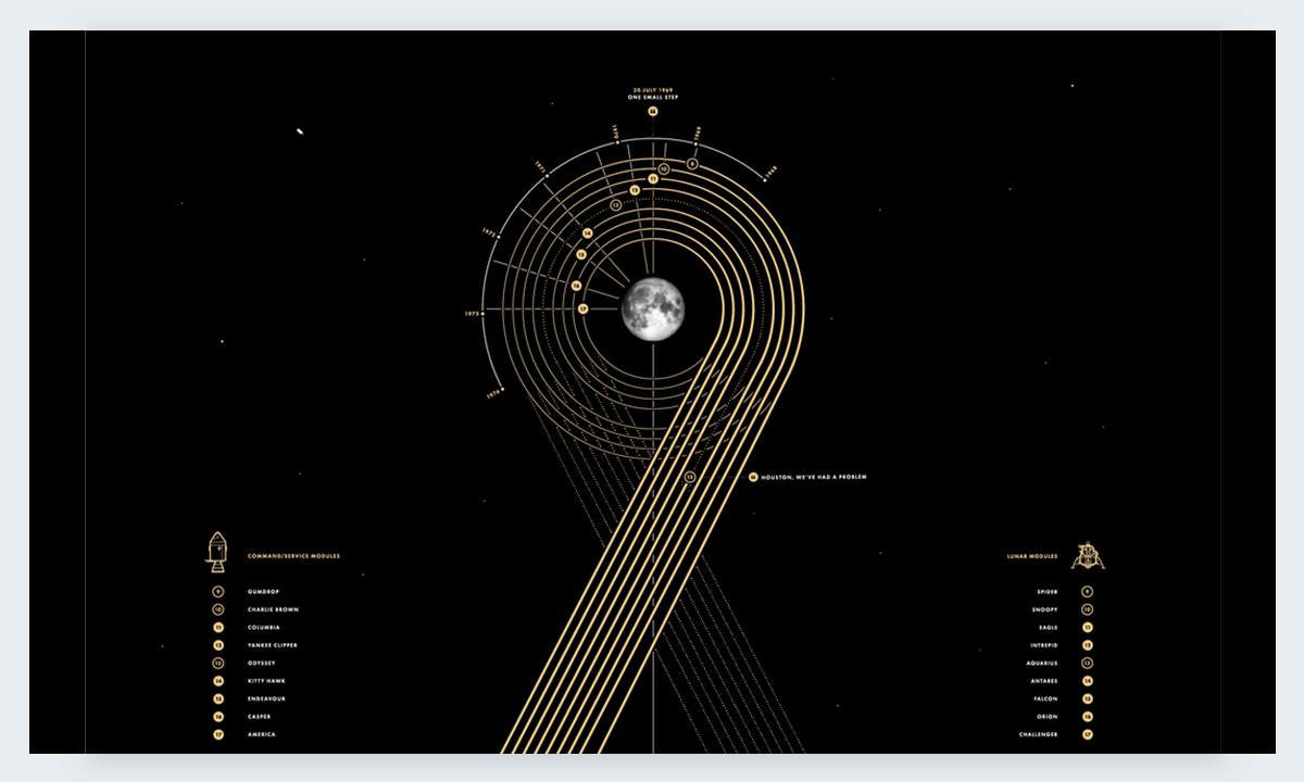
Paul Button is a graphic designer who loves analyzing data and making it beautiful beyond belief. He has always been interested in the Apollo missions and all things space related. Using collected data about every single Apollo mission, he created this data visualization. He sells it as an art print and is quite successful. The Apollo data viz poster is a real gem, not only for space exploration fanatics but anyone who loves seeing beautiful data on a regular basis.
Planet Earth
image: https://visme.co/blog/wp-content/uploads/Planet-Earth-Book-best-data-visualizations.png

This book, illustrated by data artist Federica Fragapane, is full of colorful data visualization pages about animals and plants. Planet Earth is a children’s book, so the process of creating the data visualizations was a bit different than the usual data heavy designs we see elsewhere. Federica was inspired by the children’s books she read as a child and used a style guide to help her maintain a color palette for a balanced style throughout the book.
Keuzestress: Searching for the ‘Correct’ Mascara
image: https://visme.co/blog/wp-content/uploads/Keuzestress.-Searching-for-the-%E2%80%98correct%E2%80%99-mascara-best-data-visualizations.png

Sonja Kuijpers from Studio Terp couldn’t pick what mascara she wanted to buy at the makeup store. In order to make a decision, she relied on data and her creative talent. Her visualization about mascara visualizes data from one online makeup store in The Netherlands. The data shows the color of each mascara and what its special characteristics are; lash separation, giving volume or length, and waterproof capabilities. With this data analysis she was able to figure out just which mascara she needed. Creating beautiful data art in the process.
Marvel Cinematic Universe
image: https://visme.co/blog/wp-content/uploads/Marvel-Cinematic-Universe-best-data-visualizations.gif

If you have seen any of the Marvel movies, you know that the characters and stories are intertwined with all the other movies. Since 2008, all Marvel movies actually make up the Marvel Cinematic Universe. With this interactive data visualization, now there is a fun way to understand connections between characters and movies inside the Marvel Cinematic Universe. Created by the data artists of the Straits Times in Singapore, this data viz is entertaining and easy to navigate. Marvel fanatics will really enjoy this one!
Living Space
image: https://visme.co/blog/wp-content/uploads/LivingSpace-best-data-visualizations.gif

Living Space is an interactive data visualization about the International Space Station. Beyond Words Studio designed the project for BBC Future. The interactive design depicts every step of the construction of the International Space Station. This Data Viz / Interactive infographic is from 2015 but it’s still a big favorite with us.
The Many Moons of Jupiter
image: https://visme.co/blog/wp-content/uploads/The-Many-Moons-of-Jupiter-best-data-visualizations.png

Do you know how many moons Jupiter really has? Did you know that Ganymedes, the largest one, is bigger than the planet Mercury? Designer James Round created this data visualization about the many moons of Jupiter with data about the names, sizes, date of discovery, and discoverer about each moon. It’s easy to read and quite colorful. It could easily be printed as a poster to hang on the wall.
Crazy Rich Asians
image: https://visme.co/blog/wp-content/uploads/Crazy-Rich-Asians-best-data-visualizations.gif

The hottest movie of the summer stirred up some realities about rich Asians not only in the US but also in Asia. The South China Morning Post created a series of data viz charts and interactive visualizations about the real wealth gap in Asian countries compared to the rest of the world. The entire set is quite interesting, the more fun being the interactive chart about how much rich people spend on clothes. The data adds up as you dress the people in the chart.
The Women of Data Viz
image: https://visme.co/blog/wp-content/uploads/The-Women-of-Data-Viz-best-data-visualizations.png

Alli Torban from Data Visualization Today was inspired by the Keuzestress visualization about choosing the right mascara which we mention above. Alli used a similar style to the eyes in the mascara visualization, but using hearts. Her data set was the survey results about women in data visualization conducted by Elijah Meeks. The Women in Data visualization was an exercise in getting personal with data to the point of really knowing what you are working with.
Figures in the Sky
image: https://visme.co/blog/wp-content/uploads/Figures-in-the-Sky-best-data-visualizations.png

Astronomy and interplanetary data are a main topic for amazing data visualizations and this one is no different. The large set of visualizations which makes up Figures in the Sky is all about how stars are shared by different cultures when imagining constellations. The three stars of Orion’s Belt, for example, is used by 17 different cultures as part of lots of different kinds of constellations. Astronomer and data viz lover Nadieh Bremer did an amazing job with this data viz collection.
The Most Violent Cities
image: https://visme.co/blog/wp-content/uploads/The-Most-Violent-Cities-best-data-visualizations.png

This data visualization by Federica Fragapane recollects data about the quantity of homicides in cities all around the world. The graphic is set up showing cities as verticals with different shapes depicting the total number of homicides placed along the horizontal axis of the total population. The data viz includes a legend on how to read the data and a small section with data only about Italian cities. It was created for the Corriere Della Sera culture supplement.
Travel Visa Inequalities
image: https://visme.co/blog/wp-content/uploads/Travel-Visa-Inequalities-best-data-visualizations.gif

Sometimes a data visualization can be extremely helpful. Like this one about travel visa inequalities. Christian Laesser created this data viz after traveling to Thailand and wondering how each country had different travel visa advantages. This interaction design lets users click on a country and find out if a visa is needed to visit any other country and vice versa.
CF Weather Charts
image: https://visme.co/blog/wp-content/uploads/CF-Weather-Charts-best-data-visualizations.png

Clever and Franke are a data design company that works doing data analysis and design in both The Netherlands and the US. The CF Weather Chart is one of their favorite special projects. The latest version, the Fifth Edition, came out earlier this year and it’s all about how weather affects our emotional states. The data viz collected tons of data about weather patterns and what people do at different times of the year. Correlations were made and the data viz set includes around 60 visualizations. The finished data art is sold as a printed poster.
Lessons Learned From Those We’ve Lost
image: https://visme.co/blog/wp-content/uploads/Lessons-Learned-from-those-We%E2%80%99ve-Lost-best-data-visualizations.png

This is another great data visualization by designer James Round. This time he concentrated on data about about a hundred years of extinct species. The purpose was to analyze how they became extinct, when, why. Maybe with this data analysis we can learn how to save endangered animals in the future.
Oddity Viz
image: https://visme.co/blog/wp-content/uploads/Oddity-Viz-Valentina-D%E2%80%99Efilippo-and-Miriam-Quick-best-data-visualizations.png

When most music based data visualizations are about set of albums and songs, or about an entire era, Oddity Viz is about one song. Valentina D’Efilippo and Miriam Quick extensively anazalyzed the David Bowie song, Space Oddity, to create this beautiful set of data visualizations. The series is made up of ten engraved records, each depicting one aspect of the song; harmonies, melodies, lyrics, and more. Each record is accompanied by a poster and key on how to read the data viz.
228 Years of POTUS
image: https://visme.co/blog/wp-content/uploads/best-data-visualizations-228-Years-of-POTUS.png

Not yet updated for the 45th President, this data viz is a complete recollection of data about all the Presidents of the United States. Another James Round beauty, this data visualization explores 228 years of POTUS with data like political parties, education, age, and length of position in office.
Yes, There Really Is A Lot of Space Junk
image: https://visme.co/blog/wp-content/uploads/Yes-There-Really-is-a-lot-of-Space-Junk-best-data-visualizations.png

The data team at Axios created this data viz with data from the U.S. military’s Joint Space Operations Center. According to their data, there are over 13,000 singular pieces of space junk floating around in low Earth orbit. Even though the data is staggering, they know that it’s not complete, since a lot of the junk doesn’t register in satellites due to size and other factors. The Joint Space Operations Center hopes to get more information about other pieces of space debris so that everyone involved in space exploration is informed about the dangers of space junk.
An Ode to Cardcaptor Sakura
image: https://visme.co/blog/wp-content/uploads/An-Ode-to-Cardcaptor-Sakura-best-data-visualizations.gif

Personal data viz projects created by professional data artists are usually extremely creative. This one by Nadieh Bremer is a data visualization about the Japanese Manga series Cardcaptor Sakura. The design is colorful, fun, entertaining, and of course full of data. Best of all, it’s also interactive.
Galaxy of Covers
image: https://visme.co/blog/wp-content/uploads/Galaxy-of-Covers-best-data-visualizations.gif

How can music and a love of interplanetary ideas mix together to make a data visualization? With this lovely interactive example of a data analysis about famous song covers. Each song is a planet and its covers are satellites orbiting around it. Each song planet can be clicked on to visualize its own specific data. This data viz was created by the team at Interactive Things and is a real treat.
Red Bull Party Visualization
image: https://visme.co/blog/wp-content/uploads/Red-Bull-Party-Visualization-best-data-visualizations.png

This data visualization project is not from this year, it’s actually from a couple of years ago. But we love it so much it had to be included. During a party in Amsterdam, guests were given a special bracelet with a sensor that would collect data about their experience in the club. It collected information about what part of the club they were in and what they were feeling at that time. At the end of the night, when the guest gave back the bracelet, they were given their own print of data art created with the data collected throughout the night.
Bruises, the Data We Don’t See
image: https://visme.co/blog/wp-content/uploads/Bruises-the-data-we-don%E2%80%99t-see-Giorgia-Luppi-best-data-visualizations.png

In some instances, the data is really personal, and the final product is more a work of art than a collection of charts and graphs. In this project, the data analyzed was of a human nature. Italian data designer Giorgia Luppi created this artistic data viz as a way to help her friend cope with her son’s medical issues. She used the medical records for the child’s treatment and incorporated art and music to create this beautiful data visualization.
Coral Cities
We caught this data visualization in mid build. Not sure if the data artist will be creating a full spectrum project out of it or not but in the meantime we love seeing his coral cities popping up on Twitter. Craig Taylor used the data from the 10 Most Liveable Cities index along with a city map tool, to create these visualizations that look like corals.
Market Cafe Mag
image: https://visme.co/blog/wp-content/uploads/Market-Cafe-Mag-best-data-visualizations.png

This entry is not exactly a data viz, but a whole magazine dedicated to data visualizations. The Market Cafe Mag is on its third edition and is only getting better with every new publication. With interviews, features, and stories by and about visual data artists, this magazine is becoming a need for all lovers of data visualizations. Their 2018 edition is already sold out. Designers and creators Tiziana Alocci and Piero Zagami have really hit the nail with this mag.
Over to You
Have you seen any data visualizations created this year that should be included in this list? Do you create data visualizations and would like us to have a look at it? Leave us a note in the comments section!
Transforming Enterprises with
Data & AI Services & Solutions.
ThirdEye delivers Data and AI services & solutions for enterprises worldwide by
leveraging state-of-the-art Data & AI technologies.